
Matte vs Glossy Book Covers: Which Finish Should Authors Choose?

Matte versus glossy is a practical cover decision, not a contest between a cheap-looking book and a premium one. Start with the design, examine the actual production samples and choose a treatment you can justify. Reader clarity and a verified physical result matter more than a universal rule about which surface an author should prefer.
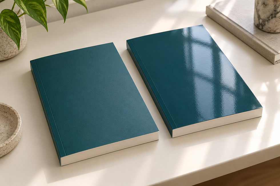
Choose the finish after the cover has a clear job
A cover finish is one part of a book's physical presentation. It cannot repair a title that is difficult to read, a misleading visual promise or artwork that does not fit the reader. Before comparing surfaces, decide what the design should communicate at a glance. The finish should support that message rather than become a substitute for a coherent design.
A reflective treatment may be worth testing when the cover relies on vivid imagery. A quieter surface may be worth testing when typography and restrained visual hierarchy carry the design. These are starting hypotheses, not genre laws. The useful choice is the one that works with your actual artwork and the production options offered for the edition.
What matte and glossy mean in this decision
Glossy and matte describe the cover's surface treatment, not the interior ink choice or whether the book is paperback or hardcover. As checked on September 13, 2026, Amazon KDP offers both finishes and describes glossy as shiny and matte as having minimal sheen. Its guidance gives typical uses, but those examples do not require every author in a genre to choose the same finish.
Avoid comparing a matte sample with one illustration to a glossy sample with completely different artwork and declaring a winner. That comparison changes two variables at once. If the question is specifically about finish, use the same design, equivalent production specifications and consistent lighting. Otherwise, it becomes difficult to know whether your preference comes from the surface or the underlying cover.
Test title readability before judging atmosphere
Readers need to identify the title and author without working through visual clutter. Examine the design at the size it will be printed, then step back to approximate a browsing situation. Check the hierarchy of the title, subtitle and author name. A pleasant tactile surface does not compensate for weak contrast or a subtitle that becomes too small to read.
Repeat the check under more than one ordinary light source. Turn the book rather than judging it only from a single attractive angle. If reflections interrupt an important element, note where and when that happens. If the quieter sample feels flat, ask whether the artwork or typography needs improvement before assuming a different finish is the only solution.
Separate screen thumbnails from printed surfaces
A retailer thumbnail represents the cover image, while a physical copy adds material, light and handling. The two experiences are related but not identical. Evaluate the digital artwork separately at small sizes. Do not expect a production finish to rescue a thumbnail in which the title disappears or the central image becomes unrecognizable.
For photographs used in promotion, a real copy can help you judge how the finished object behaves under your intended lighting. Test a simple setup instead of assuming a glossy mockup on screen will predict every reflection. Keep the book identifiable and avoid filters that misrepresent its appearance. A marketing image should help readers understand the product they will receive.
Look at handling without making universal durability claims
Authors often want one simple answer about fingerprints, scratches or long-term wear. A label alone does not establish a universal ranking. Materials, suppliers and handling conditions differ. Inspect the specific samples available from your printer and ask which surface treatment the quote includes. Do not turn a personal experience with one book into a claim about every matte or glossy edition.
If handling matters for events or repeated demonstrations, test the sample through the kind of use you expect. Record the observations and their limits. A sample used for a short review cannot establish a multi-year durability result. Equally, an isolated mark does not prove that a finish is unsuitable. Make the decision from relevant evidence rather than a confident but unsupported generalization.
Confirm what the provider actually supplies
Production labels can conceal differences between suppliers. Ask the printer which finish options exist for the exact binding and cover construction you intend to use. Do not assume that a finish offered for one paperback is available with the same specification for every hardcover. Obtain current requirements for the cover file, safe areas and dimensions before approving the final production package.
Keep the provider's terminology in your notes. If a quotation offers an additional treatment beyond ordinary matte or glossy, ask for a description and sample rather than treating it as interchangeable. Record any minimum order, lead time or price difference only when the supplier has confirmed it. This prevents an attractive design concept from becoming an unverified production promise.
Compare costs only where the quote shows a difference
Do not assume that matte is always cheaper, glossy is always more expensive or the reverse. Request comparable current quotes when cost matters. Hold the edition's other variables steady, including binding, trim, page extent and order assumptions. State the currency and whether shipping, taxes and any relevant charges are included before calculating a difference.
Then ask whether the verified difference is meaningful for the planned edition. A small production saving may not justify a treatment that weakens the design, but a premium should not be accepted merely because it sounds impressive. There is no evidence in the finish label itself that readers will pay more or that the book will sell faster. Keep those commercial claims separate from the physical design decision.
Use a proof to resolve uncertainty
A physical proof is a useful checkpoint because it brings together the actual cover design and a production treatment. Inspect the front, spine and back as a complete object. Check alignment, readable text, artwork placement and any elements near folds or trimmed edges. Do not let a strong first impression prevent you from examining the details that need correction.
If you change the artwork, production dimensions or configuration after reviewing the proof, repeat the relevant checks. Keep dated records of the approved files and the specification used. An approval applies to a particular version, not to every later export with a similar filename. This simple discipline can reduce avoidable confusion when an author, designer and printer are reviewing different stages.
Make a decision you can explain without exaggeration
Write a short decision note stating which finish you selected, what you tested and which compromises remain. For example, the rationale might prioritize readable typography under ordinary light or the way specific artwork appears on a verified sample. Avoid vague declarations that a surface makes the book prestigious, authoritative or more marketable without evidence.
For an existing published book, a change should begin with a clearly identified problem and a separate edition or production review. Consult the provider's current rules before authorizing changes. Do not alter a live listing simply because a new sample looks appealing. This guide supports a deliberate choice for physical presentation; it does not recommend changing established URLs, search intent or published content.
Frequently asked questions
Is matte or glossy better for a paperback cover?
Neither is universally better. Compare the same artwork on the provider's actual samples, then assess readability, visual fit, handling and any verified cost difference for the edition.
Does every novel need a matte cover?
No. Genre examples can suggest a starting point, but they are not mandatory rules. Choose a finish that supports the specific cover design and the reader's expectations.
Can glossy finish fix a weak cover design?
No. Resolve title readability, contrast and the visual message in the artwork first. A surface treatment cannot replace clear design or correct a misleading promise.
Will the physical finish improve my retailer thumbnail?
Do not rely on it. Test the digital cover image separately at small sizes because a thumbnail does not reproduce the full experience of light and material on a physical copy.
Which finish is always more durable?
The label alone does not establish a universal durability ranking. Inspect supplier-specific samples and describe observed handling results with their limits rather than making broad claims.
Is glossy always more expensive than matte?
Do not assume a fixed price relationship. Compare current quotes with the same production and delivery assumptions, and record any difference only when the provider confirms it.
Should I order a proof before approving the finish?
A physical proof is a useful checkpoint for appearance, readable text and cover alignment. Repeat relevant checks if the artwork or production configuration changes after approval.
Can I change a published book's finish without reviewing anything else?
Begin with the provider's current rules and a clear reason for the change. Treat it as a deliberate production decision and obtain separate approval before altering a live book or listing.


Comments